OmniSynkAI
Design system for a B2B ERP startup.

Timeline
Spring 2024
Team
Individual
Roles
Product Designer
Tools
Figma, Lottie, Tailwind CSS
Overview
Context
OmnisynkAI is a B2B ERP Startup, where business owners can list and manage inventory across eBay, Etsy, and TikTok Shop.
My Role
As a design systems intern, I organized and maintained the design system, created primitive and semantic tokens, and added new components when requested.
Impact
Modernized the design system, allowing for future scalability and closer design to development workflows.
VARIABLES
Initially
Designers were using different colors for the same use cases
General lack of organization
Variables names were unclear
Systems Work
I began my internship by creating a primitive and semantic variable system. While researching, I utilized designsystems.surf and took inspiration from Wise, Shopify, and Uber.
Created understandable semantic tokens for specific use cases
Integrated capabilities to easily change or expand system
Token syntax mirrored Tailwind CSS tokens used by development

Color
Primitive color variables were made of hex color scales, while semantic colors took the primitive tokens and added contextual names. Semantic color tokens were split into universal, component-specific, text, and border colors.


Typography
I used Figma's new typography variables to create a type system (though letter spacing/kerning didn't work quite yet).


Size
Primitive size variables comprised of multiples of 4, while semantic tokens were split between corner radius, spacing, and padding.


Impact
Modernized and future-proofed the design system
Clear tokenization led to development workflows
Unnecessary color and text styles were cut for efficiency
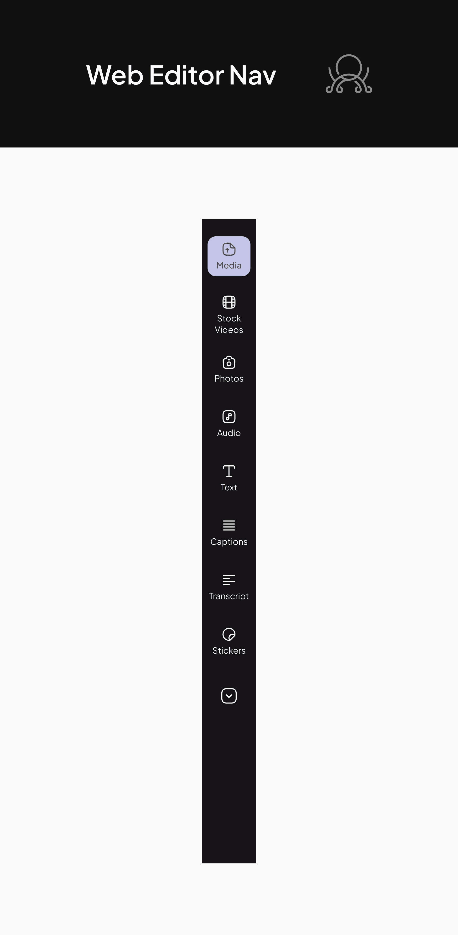
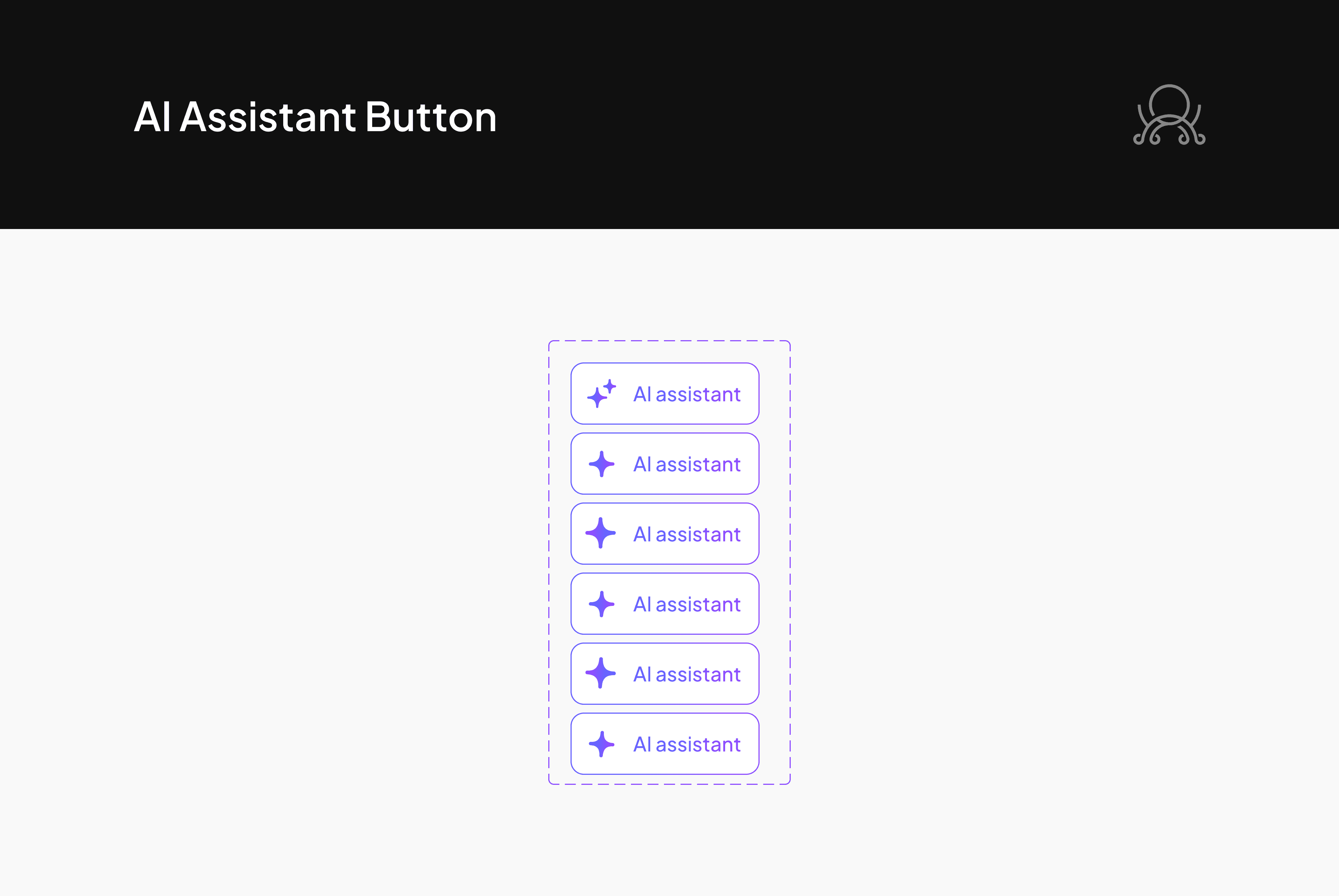
COMPONENTS
Work was done to align existing components with the new variable system. Overall, I made small changes to most components.
Changes
Applied new color and size variables
Applied new type system
Refined auto-layout to ensure responsiveness
New Components
I added new components when requested by the product design team. All components were designed with responsiveness in mind.


Reflection
My first internship! Yay!
Design System Practices
A large part of my time was spent researching best practices for design systems, and fiddling with autolayout to ensure components were responsive. I learned a lot about tokenization and development pipelines!
Company Culture
Although this internship was remote, I spoke with a lot of others in the company, including fellow designers, researchers, engineers, and managers. I gained lots of communication experience, and also used new software including Zeplin, ClickUp, and Confluence within the organization.


